Whenever I need a stand-in piece of text or a concept around which to practice a new technique, I return to Cyrano de Bergerac, the 1897 French play by Edmond Rostand. The vivid script lends itself as beautifully to developing imagery as it does to practicing typography via calligraphy and hand-typesetting. The pieces on this page are a few examples of this ongoing practice.
Acte I From its opening, Cyrano de Bergerac—a play that swept France off its feet upon its premiere—is packed with intrigue and melodrama. As a nod to the late hours against which most of the story is set, I bound a scaled-down facsimile of the play's front matter and first act into a design that evokes the palette of evening lights: yellow and oranges (light), dark browns (shadows), and dark blues (evening sky). I adapted the cover design and lettering from elements of Cyrano's contemporaneous 19th-century promotional posters.
2024. Cotton embroidery floss, various calf and goat leathers, Hahnemühle Ingres paper, Permalife paper, toner, ink. 10.3 cm x 8 cm x 1.6 cm (closed)
Images of Acte I on a gray background are courtesy of the Guild of Book Workers.
Le Dénouement Calligraphic broadside of the final speech from Edmond Rostand’s Cyrano de Bergerac, in the original French.
2017. Gouache on Hahnemühle Ingres paper. 24¾” x 18¾”
The Man from the Moon Letterpress-printed literary broadside from handset metal type (Van Dijck & Bulmer) and metal ornaments.
2017. Rubber-based ink, acrylic, and beeswax on Sakamoto paper; pochoir and stenciling. 7¼” x 9”
Fallen Gouache on indigo Cave paper.
2018. Limp paper case binding of proofs from The Man from the Moon.
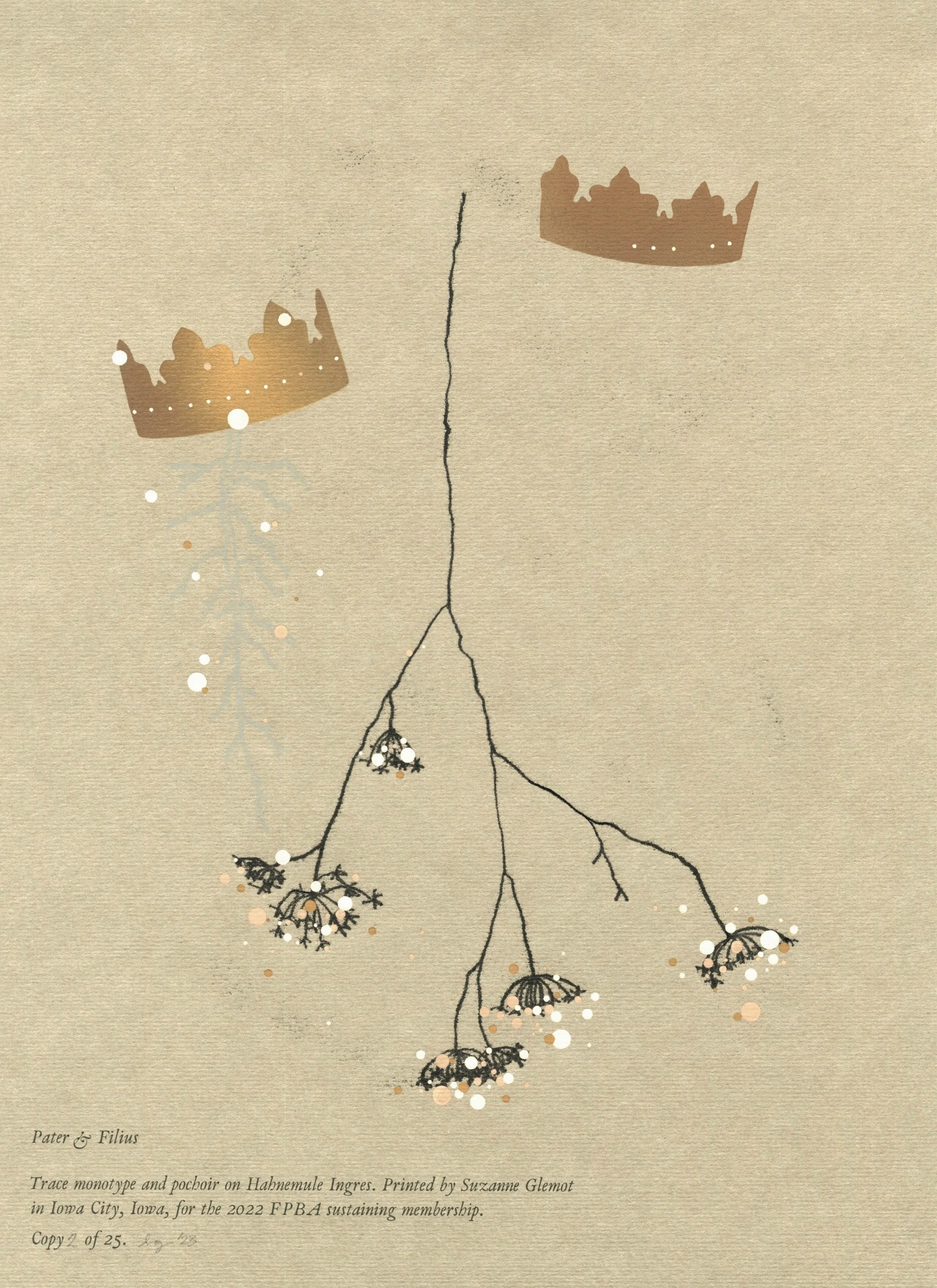
During the week we spent burying his father in early 2022, I watched my own father become the keeper of my grandfather’s memories and history. This shift happened between long strolls through deserted parks, boxes of old family photographs, and cliffs from which we stared out at distant lights. In the intervening months, I struggled to put into words the transformation I witnessed – even as I dearly wanted to transcribe it.
I eventually tried capturing those few days by revisiting some erasure poetry exercises I’d previously explored in grad school. Here, the catalog of images I’d collected on my phone during that week served as the source text from which I worked.
Pater et Filius ponders how relatives transmit memories to one another, particularly when kin pass away; it is the portrait of a parent and his child in the moments that follow the death of that parent.
Produced as the inaugural print for the Fine Press Book Association’s sustaining membership tier in an edition of 25.
2022. Gouache, water-soluble relief ink, and rubber-based ink on Hahnemühle Ingres paper. Pochoir, trace monotype, and letterpress-printed handset Van Dijck. 12” x 9”
No Constants was created in response to a year defined by uncertainties: a months-long family crisis, the onset of a global pandemic, completing graduate school in a depressed economy, environmental catastrophe, a fraught presidential election, a national reckoning over racial injustice… The weight of these concurrent events was such that when I discovered a robustly sprouting onion in an end-of-year grocery delivery, I felt unfazed, delighted, and incredulous — all at once. I found comfort in the thought that, at the end of a year in which the only constant seemed to have been the absence of constants, my home and studio were hosts to a small act of nature persevering.
Produced in an edition of 30.
2021. Gouache and pearl cotton on Winterstoke Laid paper; handmade paper from overbeaten abaca, dyed with weld and iron. Pochoir, paper cutting, punch cutting, and sewing. 9” x 12”
I spent the early days of the pandemic lockdown raking dead leaves and clearing flower beds in the yard of the house I was renting. No sooner had I finished this task that a new challenge presented itself: dandelions began their slow but persistent return into the garden over which I thought I'd gained control. Eventually, the days in lockdown grew and I stopped keeping up with the number of dandelions that scattered the grass; I watched the garden become covered in yellow. The dandelions were still blooming when protests against the murders of George Floyd, Ahmaud Arbery, and Breonna Taylor arose in my town.
Made in the early days of June 2020, this small print is a meditation on flowers as strategy of protest and resistance; it is a visual synthesis of the spraypaint I watched grow across the downtown area and the spontaneous offerings of flowers that followed several evenings of protests throughout the summer. Masses of Flowers was produced in an edition of 100.
2020. Gouache and thread on Zerkall Book paper; pochoir and sewing. 10½” x 6¼”
2020 MFA Thesis (in progress)
About the book
The boy has known the sea for as long as he can remember. He grows up on its shores and learns its ancient cliffs by heart. No matter the time that passes or the ways in which the landscape changes, he always returns.
Featuring imagery drawn from the coastal region of the Cap Fréhel in France, Memories of the Sea is a story about place and what it means to “be from,” a tale about childhood wonder, eroding seascapes, and family.
About the edition
The book is being printed from metal Monotype Centaur and photopolymer relief on Somerset paper and abaca paper made by the artist. The image plates are developed from hand-painted negatives. Memories of the Sea will be produced in an edition of 20 copies and is designed to be bound in a sewn board structure counting 74 pages. Each copy is set to be kept in a fitted enclosure. A deluxe edition of five copies is planned on Sakamoto lightweight paper in a simplified binding.
Owing to disruptions caused by the COVID-19 pandemic at the end of my MFA studies, this work is still in progress. If you would like to be included on a mailing list about this project as I resume production, please contact me and let me know.
"Quiet as it's kept, there were no marigolds in the fall of 1941." This is the opening sentence of Toni Morrison’s first novel, The Bluest Eye, published in 1970. Where they grow, flowers and plants are written into the story as recurring symbols of safe prosperity. The marigolds’ explicit absence from the world of The Bluest Eye at the outset of the novel struck me, and I frequently returned to this sentence, almost like a ritual, as I read the book. Unable to get the passage out of my mind, I set out to design and then make a small artist book that could capture and convey these words I sought to memorialize.
This 6-page pamphlet-bound accordion structure features various images of marigolds to accompany Toni Morrison’s sentence. They are letterpress printed with heavily transparent ink on both sides of a translucent and crisp handmade paper. These prints aim to underline the beauty of Morrison’s writing, all the while rendering the heart-wrenching absence of the marigolds. To further honor the flower that opens this novel, the book’s covers, also made from handmade paper, are brushed with marigold dye.
Marigolds was produced in an edition of 18 copies, with the permission of Toni Morrison and Penguin Random House.
2019. Typographic, relief, and pressure printing on handmade papers from overbeaten abaca and cotton fibers; ink, marigold dye, and linen thread. Pamphlet-bound accordion. 7” x 3¾” (closed), 7” x 20½” (open)
Rendered in natural indigo, Ramène-Moi (Bring Me Back) is a meditation on the color blue as a substitute for the ebbing tides of the coastline I hold dear—an attempt at capturing a fascination with both a color and a place.
2019. Natural indigo dip-dye progression on handmade Chancery; wooden boards, linen thread. Ethiopic binding structure. 3¾" x 2½" x 1½"
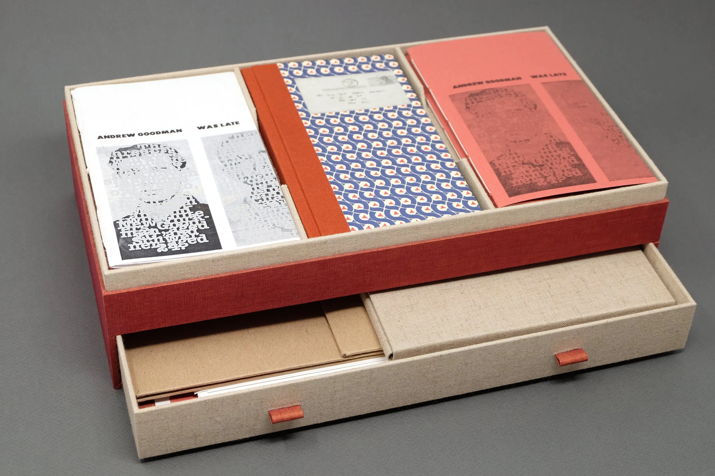
This handcrafted enclosure contains the production archives for the Andrew Goodman Was Late chapbook project. Photopolymer plates, mailers, uncut plate proofs, and unbound sheets all rest in the lower drawer of the box. Above, mockups and in-progress proofs, a case binding (made from all of the collected and preserved letterpress-printed off-prints and proofs of the book), and two copies of the completed project are contained in their respective display sections.
2018. Various book cloths and papers, book board, ink, linen thread, silk endbanding threads, photopolymer plates, rigid mailers. Pamphlet and case bindings enclosed in a bespoke, two-tiered box. 5¼” x 13⅞” x 7⅝”
This project was inspired by the careful exercise of collecting and processing vestiges for another project (Fragments in Red, in Blue) for which I punched confetti from handmade and hand-dyed papers over many days and weeks. Determined not to let the handcrafted paper scraps go to waste, I created a piece whose sole purpose is to highlight a sense of satisfaction: satisfaction to hold, open, discover, and touch.
2018. Confetti from handmade, naturally-dyed, and hand-punched papers from abaca, cotton, and flax. Arranged by color in small glass vials, enclosed in a tray and fitted Japanese portfolio box.
Fragments in Red, in Blue explores the relationship between language and memory through color. I have been told that as a child I listened to two different versions of the 1991 Beauty and the Beast movie’s original soundtrack. The English-version disc was red, while the French one was blue. I naturally compartmentalized my speech development according to these two colors, and so the adults in my world spoke either “red” or “blue.”
Throughout this book, decorative elements of handmade paper work to obstruct or reveal narrative vignettes according to the language that dominates my recollection of the moment. The text is rendered in toner transfer — a mark that gently sits on the surface of the page and is barely present. Finally, the book’s pages are connected by stiffer squares of museum board, thus lending it a sonorous and playful quality.
Handmade in a variable edition of 3 copies.
2018. Toner transfer and handmade, naturally-dyed paper confetti on Domestic Etching and museum board. 4½” x 4½” x 1”
The structures that underlie racism and race significantly informed my work in letterpress printing between 2016 and 2018. In Structure in White (Study), I collated the proofs and misprints I’d preserved from previously completed projects (documented here, here, and here). I designed the cover and the binding structure in response to the amalgamation of these reused prints: excerpts of writings on the mechanics of racism from American author and journalist Ta-Nehisi Coates are rendered and then obliterated in white gouache on a light abaca paper—a surface that is more fragile than would typically be expected of a book cover. By holding this arrangement of disparate pieces, this book archives and synthesizes my learning about the relationship between whiteness and racism in the United States.
2018. Gouache on handmade abaca paper, waxed linen thread, leather, parchment, letterpress on various machine-made papers. Long and link stitch binding structure. 9” x 6” x 1¼”
Literary broadside featuring the poem “If We Be the Weather” by Lara Mimosa Montes. Print produced in collaboration with Colleen Lawrence, with support of the University of Iowa Center for the Book, for Puerto Rico en Mi Corazón — a print portfolio organized in 2017 by Anomalous Press in support of Hurricane Maria relief.
Letterpress-printed from digitally set photopolymer plates in an edition of 50.
2018. Rubber-based ink and dip-dyeing on Winterstoke Laid paper. 14” x 11”
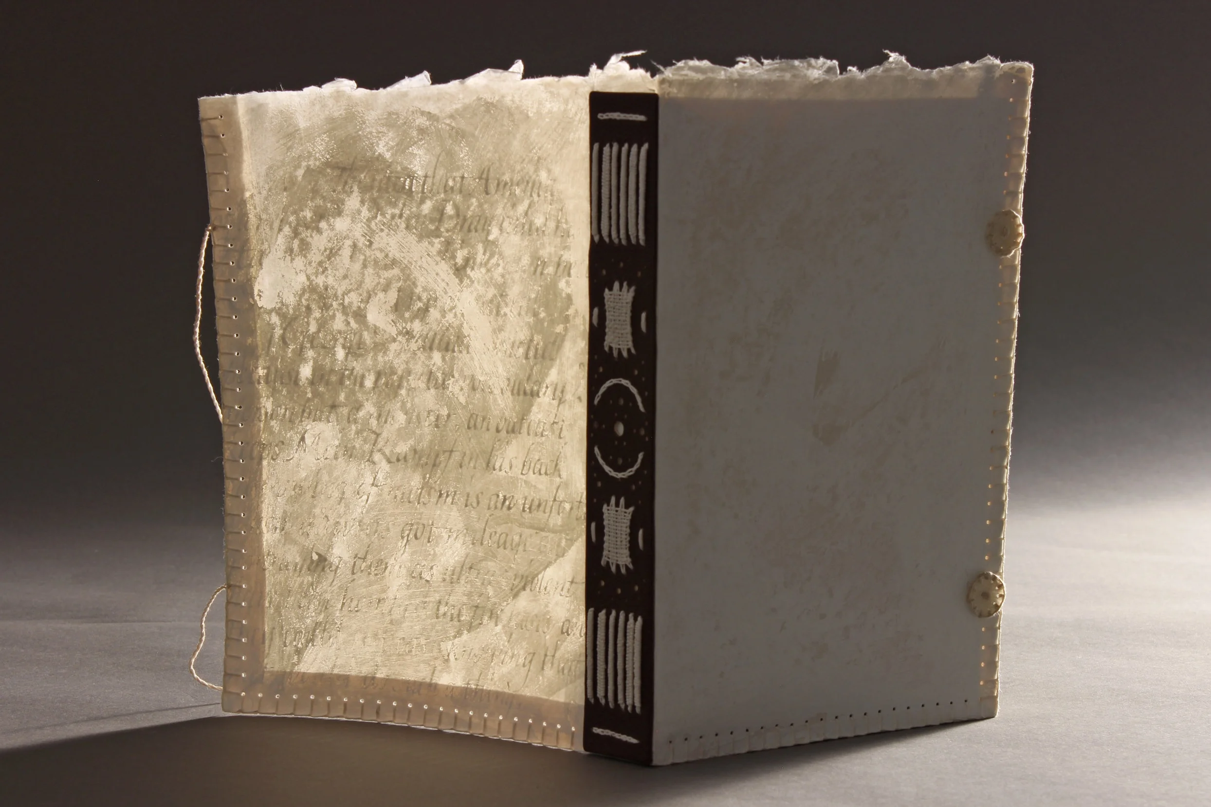
This book is inspired by Stephen Hawking's writing on black holes in his popular 1988 title A Brief History of Time. Each aspect of this book — the modified case binding, the monochromatic palette, the progressive distortion of letterforms from page spread to page spread — works to suggest the mystery and unknowable vastness of the cosmological phenomenon that are black holes.
Text used with permission of the estate of Stephen Hawking.
2017. Gouache on Hahnemühle Ingres paper; embroidery thread, book cloth, book board. Modified hardcover single-section binding structure. 10¼” x 10¼” x ¼”
This Sea Right Here reads as a single moment in time, space, and thought—extending the present moment by fragmenting it across multiple pages. The handheld dimensions of the object, its journal-like binding structure, and the presence of hand-lettering make the act of moving into and then through the book, from hand-cut panel to hand-cut panel, a more intimate reader experience of this fragmented landscape.
2017. Cave paper, hand-cut Stonehenge paper, gouache, waxed linen thread. Long and link stitch binding structure. 6” x 4¼” x 1”
This work honors the victims of the 1964 Mississippi Burning case in which three young Civil Rights worker — James Earl Chaney, Michael Schwerner, and Andrew Goodman — were murdered in Neshoba County, Mississippi, by members of the Ku Klux Klan.
The cover is rendered from primary documents produced by the FBI early on in its investigation of the Mississippi Burning case, and speaks to a book object that is witness to a particular historic moment. The proportions of the page spreads are all designed from the specific proportions of the Spectrum Monotype typeface used across the piece. This edition, rooted in the typographic design traditions of fine press work, makes use of non-precious materials and structures to better reach and travel between its readers. All throughout, the design of this book object works in service of the story printed across its pages, and invites readers to engage its narrative with careful intention.
As a collaborative work that asks for the participation of its readers, this piece offers a point of departure for individuals looking to engage with questions of race and social injustice. Indeed, the conclusion of the narrative asks its readers to consider their place in the ongoing work towards social justice in the United States of America. In the end, Andrew Goodman Was Late challenges assumed conventions of reader-interaction and asks that, as holders of the story with which they’ve grown familiar, readers inscribe their names into the book as the chapbooks travel from person to person — thus creating a record of individuals who have received, contemplated, and transmitted the story.
Letterpress printed from photopolymer plates in an edition of 53. Click here to discover the archive for this chapbook project.
2017. Mohawk Superfine paper, Canson Mi-Teintes paper, ink, waxed linen thread. Pamphlet binding. 7” x 4¼” x ⅛”
Responsive prints produced in the days that followed the outcome of the 2016 United States presidential election, and contributed to a spontaneous community display that emerged and grew in the halls of the University of Iowa Center for the Book.
2016. Hand-set metal type, wood type, and linoleum relief; rubber-based ink on Mohawk Superfine paper.
This work juxtaposes Claude McKay’s 1922 poem “The Lynching” with the names of unarmed Black persons who’d been killed by police in recent years at the time of printing. In setting these two texts alongside one another, the viewer is asked to reckon with the violent spectacle of these killings as a contemporary form of media lynchings.
The creation of this piece was inspired by looking back on seven years spent living in Mississippi learning about the make-up of these United States. “Dear White Friends” is a call specifically to white Americans to do the work of recognizing the racial violence and inequity before them. Letterpress-printed in an edition of 20.
2016. Rubber-based ink on Johannot paper; hand-set metal type and photopolymer relief printed damp. 9” x 12”
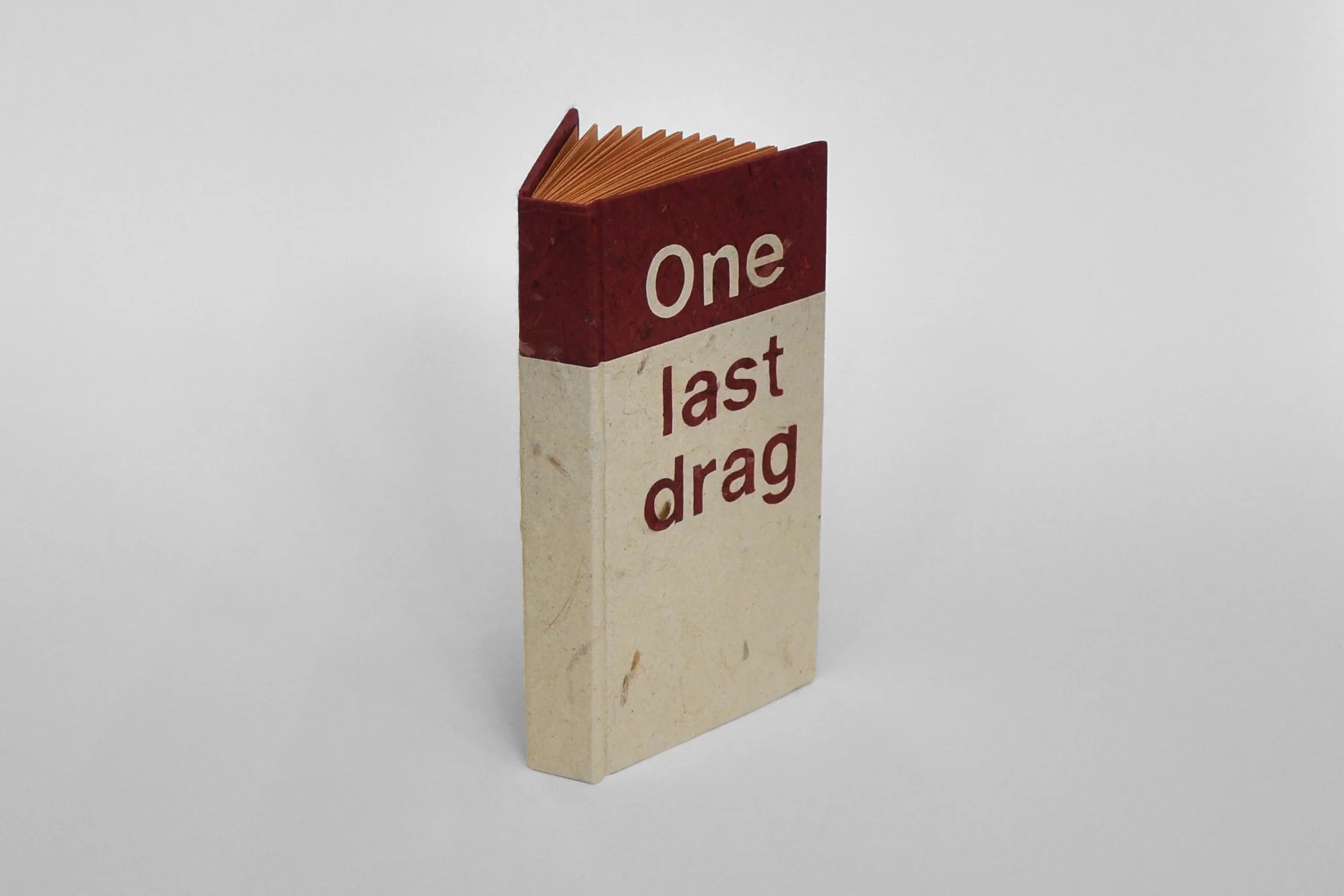
On cold Mississippi nights, cigarettes, the fragmentation of memory, and longing.
“We pass it back and forth, fingers hardly touching, both desperate for the smallest bit of warmth on this bitterly cold night. And with each drag, these minutes we share grow shorter, our lungs darker, and the sky below which we stand glows with laughter — and the last of the dying ember.”
2015. Hand-cut lettering from stencils on machine-made cover-weight paper; various decorative papers, waxed linen thread, book board. Case binding structure. 6¼” x 3¼” x ¾" (closed)
Jeux de Mémoire (French for “memory game”) tries to embody the process of compartmentalizing memories. More specifically, it explores what information is preserved and what information is lost or eroded in the process of “putting away” a moment or thought. The juxtaposition of hand-sewn details with digitally printed images seeks to evoke a delicate sense of nostalgia; neutral color palettes and repeated patterns across Jeux de Mémoire try to bottle the tension between the sensation of all there is to be remembered from a moment and the inevitable realization that not all details can be recalled. All at once, the degradation of memory can exist as beautiful, engaging, and empty.
2013. Thai traditional Unryu paper, Lamali Lokta paper, Kitakata paper, cotton embroidery thread, digital printing. 4½” x 6½” x 1⅝” (closed)